
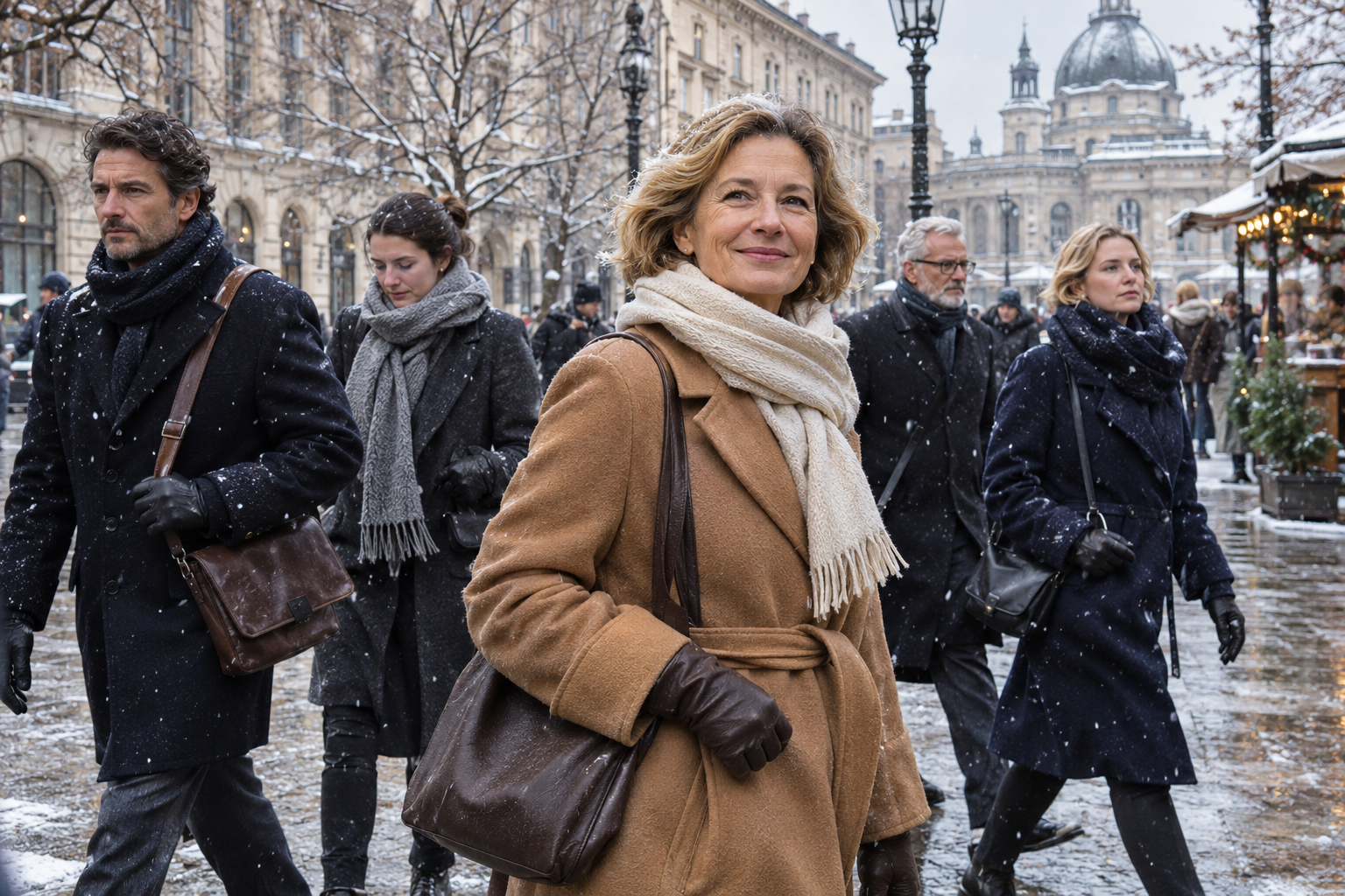
Watch a European crowd move through a city in winter and notice the colors, or rather the lack of them. Black, navy, charcoal, camel, grey, cream. A sea of quiet, muted neutrals, with perhaps the occasional deep green or burgundy as the boldest note in sight. The overall effect is calm, coordinated, and quietly elegant.
Now picture a typical American winter crowd, and it pops. Bright red puffers, electric blue, purple, patterns, logos, technical colors engineered to be seen on a ski slope. Where the European crowd is a study in restraint, the American one is a burst of color, and set side by side, there is no question which reads as more polished and which reads, frankly, as louder.
This is the winter palette rule, one of the quiet secrets behind why Europeans look so pulled-together in the cold, and it is one of the easiest things to borrow. Here is what the palette actually is, why neutral colors read as so elegant, why bright American coats look loud by comparison, and how to build your own winter wardrobe around it. It may be the cheapest style upgrade of all, because it is mostly about choosing, not buying.
The Quiet Palette

The European winter palette is tight and disciplined, built from a small family of neutral colors that all work together. At its core are black, navy, charcoal grey, and camel or tan, joined by softer neutrals like cream, ivory, and grey, and that is very nearly the whole range.
The boldest colors you tend to see are deep, muted, and wintry, a forest green, a burgundy, a rust, a dark olive, used sparingly and treated almost as neutrals in their own right. There is very little of the bright, saturated, high-contrast color that fills an American winter, and almost none of the loud patterns, logos, and technical hues of performance wear. The palette is soft, grown-up, and restrained, and it is remarkably consistent from person to person and city to city.
The result is a kind of visual harmony across a whole European crowd, where nearly everyone is wearing variations on the same quiet colors, and it reads instantly as sophisticated. Nobody stands out garishly, everybody coordinates, and the overall impression is of a population that has collectively agreed that winter is a season for understatement. It is not a rule anyone states or enforces; it is simply the shared instinct of how one dresses when it is cold, and it produces an elegance that is hard to miss once you have seen it.
There is a seasonal logic to it, as well. Winter light is soft and grey, the landscape is muted, and deep neutrals sit naturally within that, where summer invites the bright colors that suit strong sun and green and blue. The quiet winter palette is partly just a matter of dressing in harmony with the season itself, which is one more reason it looks so right rather than merely restrained.
Why Neutrals Read as Elegant
The reason this quiet palette looks so good is worth understanding, because it is not an accident of taste. Neutral colors simply tend to read as more elegant, more expensive, and more timeless than bright ones, and there are real reasons why.
A restrained palette signals a certain confidence and taste. Loud, varied, trend-driven color can read as trying hard, as cheap, or as chasing a fashion that will date within a season, whereas neutrals look considered, deliberate, and permanent. They carry an air of quiet luxury, the sense that the wearer did not need to shout to look good, and that understatement is itself the mark of knowing what you are doing. The expensive-looking outfit is very often the quiet one.
You can see the same principle at work far beyond clothing. The most expensive cars, watches, and interiors tend toward restraint and muted tone rather than flash, because true luxury has long signaled itself through quality and understatement rather than loudness. Dressing in quiet neutrals taps into exactly that association, lending even inexpensive clothes a little of that expensive, considered air, which is a remarkable thing for a choice of color to do.
Neutrals also flatter almost everyone and never go out of style, which compounds their advantage. A camel coat or a black one looks good on nearly any person and will look good for decades, where a bright trend color flatters fewer people and feels dated far sooner. The quiet palette is, in a real sense, the safe and the sophisticated choice at once, which is a rare combination, and it is why the most elegant dressers across cultures tend to converge on roughly the same small set of neutral tones. Restraint, it turns out, is one of the most reliable routes to looking good.
Why American Coats Look Loud

Set against all this, the brighter American winter palette can look loud, and it is worth being fair about why, because it is not simply a failure of taste. A good part of it is practical and structural, flowing directly from the puffer.
Technical outerwear, the padded jackets and performance coats that dominate the American winter, comes in bright, saturated, high-visibility colors as a matter of course, because that is how sportswear is designed and marketed. A puffer built for the ski slope is meant to be seen in the snow, so it comes in electric blue and bright red and bold patterns, and when that same garment becomes everyday city wear, the loud color comes along with it. The brightness is baked into the kind of coat Americans tend to wear.
There is also a genuine cultural comfort with color and self-expression in American dressing, a cheerfulness and individualism that is appealing in its own right and not something to apologize for. Americans, broadly, are less afraid of color than Europeans, more willing to wear a bold hue or a fun pattern, and there is real warmth and personality in that. The point is not that bright color is wrong; it is simply that it reads as louder, and that in a European context, set among all those neutrals, the bright American coat stands out like a raised voice in a quiet room. It is conspicuous rather than incorrect, which is a distinction worth keeping in mind.
It is also worth remembering that the loudness is often invisible to the wearer and obvious only in context. A bright coat looks perfectly normal in an American parking lot full of other bright coats, and only reveals itself as loud when it is set against a street full of European neutrals. The color has not changed; the backdrop has, which is why so many travelers only notice their own brightness once they are abroad and surrounded by quiet.
Neutrals Are Not Boring
The great fear that stops people from embracing the quiet palette is that neutrals are boring, that a wardrobe of black, grey, and camel will be drab, monotonous, and lifeless. This fear is understandable and almost entirely wrong, and understanding why is the key to the whole approach.
In a neutral palette, the interest simply comes from somewhere other than color. It comes from texture, the softness of cashmere, the nap of wool, the sheen of leather, the chunk of a cable knit, which all become far more visible and important when color is not shouting over them. It comes from cut and fit and silhouette, the drape of a good coat, the line of well-made trousers, which the eye can actually appreciate when it is not distracted by a bright hue. The quiet palette is not the absence of interest; it is interest relocated from color to craft.
And where color does come in, it comes as a single, deliberate accent rather than an all-over riot. One scarf in a rich shade, one bold lip, one beautiful bag, against an otherwise neutral outfit, and the color sings precisely because everything around it is quiet. This is the sophisticated way to use color, as a focused accent that draws the eye to one point, rather than as a general brightness everywhere. Far from being boring, a neutral palette with one perfect accent is often the most striking look of all, and it is anything but lifeless.
The neutrals themselves are also far more varied than the word suggests. Camel, taupe, oatmeal, stone, charcoal, ink, chocolate, cream, these are a rich and subtle family, full of warmth and depth, not a single flat non-color. Dressing in neutrals well means learning to see and combine these shades, to pair a warm camel with a soft cream or a cool grey with a deep navy, and there is real artistry in it. Boring is the last word for a palette handled with that kind of care.
Everything Goes With Everything

Beyond the elegance, the neutral palette has a practical superpower that is almost reason enough to adopt it on its own: everything goes with everything. When your winter wardrobe is built from a small family of coordinating neutrals, every piece works with every other piece, and getting dressed becomes effortless.
This is the quiet genius of the capsule approach that the quiet palette makes possible. A camel coat, a navy sweater, grey trousers, black boots, a cream knit, all of these can be combined in nearly any configuration without a single clash, because nothing in the palette fights anything else. You can get dressed in the dark, pull any two or three pieces together, and know they will work, which is a freedom that a closet full of clashing bright colors can never offer.
The efficiency of this is real and underappreciated. A handful of good neutral pieces generates a huge number of workable outfits, where the same number of loud, specific-colored pieces generates far fewer, because each bright item only goes with a few things. The neutral wardrobe does more with less, delivering more outfits, less decision fatigue, and never a morning spent staring at clothes that refuse to coordinate. It is the palette that makes a small, considered wardrobe actually function, which is a large part of why elegant dressers rely on it.
How to Build the Palette
Putting this into practice is refreshingly straightforward, because it is mostly about editing and choosing rather than buying a great deal. The method is to settle on a small base of neutrals and let your winter wardrobe grow within it.
Start by choosing your base family, the neutrals that suit you and that you will build around. It might be a cool palette of black, charcoal, and grey; a warmer one of camel, cream, and brown; or a classic navy-and-camel combination, but the point is to pick a coherent family rather than collecting random colors. Then let the major pieces, the coat, the knits, the boots, the bag, all live within that family, so they coordinate by default. Add interest through texture and cut rather than color, and introduce color only as a single accent, through a scarf, a lipstick, or one statement piece, kept deliberately small against the neutral ground.
That is essentially the whole system, and it compounds beautifully over time. As you replace and add pieces, keeping each one within the palette, your wardrobe becomes ever more coordinated and ever more useful, until almost everything you own works with almost everything else. You end up with the European winter look not through any single purchase but through a consistent principle, applied patiently, which is exactly how these things are built. It is a slow, cheap, forgiving kind of transformation, the sort anyone can manage one sensible purchase at a time.
The Confidence of Restraint

In the end, the palette rule comes down to a kind of confidence, the confidence to let quiet do the work that loud usually tries to do. And as with all these style divides, it would be wrong to cast the American love of color as a flaw, because it is not. Color is joyful, expressive, and full of personality, and there is nothing to apologize for in loving a bright coat or a bold pattern.
But if the goal is the elegant, pulled-together European winter look, the neutral palette is the foundation it is built on, and it happens to be the easiest and most economical foundation there is.
It costs less in the long run, because everything coordinates and nothing is wasted; it is easier, because nothing ever clashes; and it is timeless, because neutrals never date. You give up a little brightness and you get, in return, a wardrobe that is more elegant, more versatile, and more durable, which is a very good trade.
So wear color if it brings you joy, by all means, especially as those small, deliberate accents that a neutral palette shows off so well. But if you have ever looked at a European winter crowd and wondered why they all look so effortlessly chic in the cold, a large part of the answer is simply that they are not shouting.
The quiet palette is one of the great open secrets of looking good in winter, available to anyone willing to trade a little color for a lot of elegance, and it asks nothing but the confidence to keep things calm. Once you have tried it for a season, you may find you never want to go loudly back.

About the Author: Ruben, co-founder of Gamintraveler.com since 2014, is a seasoned traveler from Spain who has explored over 100 countries since 2009. Known for his extensive travel adventures across South America, Europe, the US, Australia, New Zealand, Asia, and Africa, Ruben combines his passion for adventurous yet sustainable living with his love for cycling, highlighted by his remarkable 5-month bicycle journey from Spain to Norway. He currently resides in Spain, where he continues sharing his travel experiences with his partner, Rachel, and their son, Han.